God is bigger than a church building. He reveals himself to us in myriad ways: through the Bible savored in silence or thundered in a sermon, through prayerful solitude or bread broken with others. He reveals himself in the contours of nature and whispers of wind. We do not rely on church buildings for divine encounter.
And yet churches can reveal God to us. If we pay attention.
As an architect, I am learning how to read buildings. In the same way musicians must be musically literate, architects must be architecturally literate. A musician must be constantly exposed to a range of compositions to develop musical literacy; an architect must engage all kinds of buildings to be able to read them. This isn’t simply a matter of naming specific styles or noting unique details. It’s learning to understand what statements or narratives are embedded within the design of a building.
So, I study churches. Church, of course, is a weekly rhythm of small group, choir practice, Bible study, Sunday school, and an inevitable potluck. Church is community and fellowship and belonging. More broadly, there is “one holy, catholic and apostolic church” that spans time and culture. But there are also these buildings that often hide in plain sight.
Embedded in every church is a theology that reminds us of our relationship to God through Christ. If we can learn to read the buildings architecturally, through their elevation, plan, and section, we can grasp what the structures are communicating about God—and, perhaps, what God is communicating to us through these churches.
Elevation
Well before we ever enter a church, we can begin to read its theology simply from its exterior or elevation. An elevation is how a building looks. A church’s posture toward the surrounding world is communicated through its elevation. Many traditional churches are designed to be outwardly explicit in delineating the sacred as a place set apart.
For example, notice whether there is a bell tower, which signifies that the church is a building of both visual and auditory “otherness” from its surrounding context. Note the color and material of the entryway. Traditionally, red doors signify the blood of Christ and demarcate the church as a place of sanctuary. Note any floral ornamentation on the facade that both recalls the Garden of Eden and prefigures the new heaven and new earth.
 Illustration by Mallory Rentsch / Source Images Courtesy of Amanda Iglesias / WikiMedia Commons
Of course, note any overtly Christological imagery. For example, Chicago’s St. Peter’s in the Loop reminds us that Christ’s atoning sacrifice on the cross is indiscriminate: Suspended on the Madison Street facade is an enormous dying Christ, offering himself to the daily onrush of commuters, tourists, and impoverished alike. Above the west entrance of the National Cathedral in DC, however, we find God’s ex nihilo creation of Adam, a swirling and visceral reminder that from dust we come and to dust we will return.
However, a church exterior need not be expressly iconographic to tell the story of God’s work in the world. In fact, most are not.
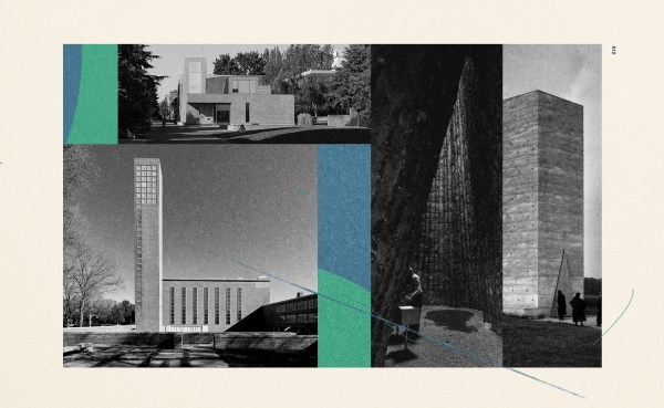
Many post–World War II churches were designed as a corrective to the perceived excesses and antiquarianism of preceding styles. Such “mute” facades communicate an incarnational approach to the world that eschews this idea of a sacred-secular divide. The Chicago suburban churches of Edward Dart are simple edifices built in common brick. Taking on the scale and material of “everyday” architecture—such as a school or a library—Dart’s modest churches remind us that the infinite God took on flesh and dwelt among us.
 Illustration by Mallory Rentsch / Source Images Courtesy of Amanda Iglesias
Further, St. Anna’s Church in Düren, Germany, was designed by Rudolf Schwarz with the rubble of its medieval predecessor, which had been destroyed during a 1944 Allied airstrike. The simplicity and austerity of the church belie what is in fact heavily marred masonry walls, a reconstitution of assembled fragments. We are reminded that in God’s kingdom, broken things, people, and places are made whole again.
Plan
Inside a church, we take note of the architectural plan. The plan is what organizes a building on the horizontal plane. It reveals a church’s conception of our relationship to one another.
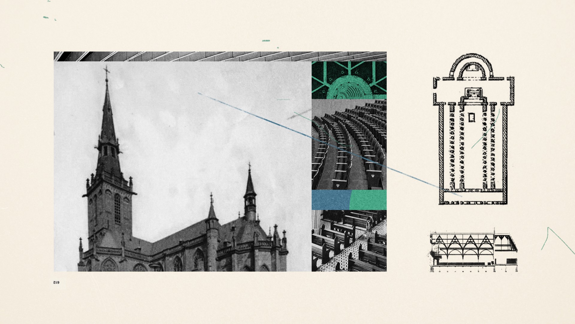
For example, note the presence or arrangement of altar, font, and baptismal. These elements create spaces for liturgical participation and designate the format of collective worship. The location and visibility of pulpit, lectern, or stage, however, reveal to us an emphasis placed on preaching. The seating shapes our posture and receipt of the Word.
Further, take note of how the seating arrangement shapes social dynamics: Semicircular auditorium seats gather congregants around a fixed stage; linear pews uphold a hierarchy and separation from the altar; simple folding chairs allow for self-determination according to a congregation’s changing needs.
Beyond the interior layout, however, the architectural plan is theologically motivated and historically inherited. After Constantine’s 313 Edict of Milan propagated Christianity as the religion of the empire, churches began to adopt the civic Roman basilica as the formal architecture of Christianity. Under imperial patronage, the basilica church developed a liturgy of procession, hierarchy, and veneration, all of which emphasize Christ as emperor. The cruciform cathedral layout also emerged from this basilica type, proclaiming the work of the Cross not just inwardly in plan but outwardly at the scale of the city.
Contrast this with the domestic, interior environments of Jesus’ ministry and covert early church gatherings. At the opposite scale of the cathedral, we find the table to be the smallest plan of a church, an intimate gathering where believers can fully participate in the Lord’s Supper. Many churches employ centralized plans to recreate this intimate scale and break down the historic hierarchy between laity and clergy.
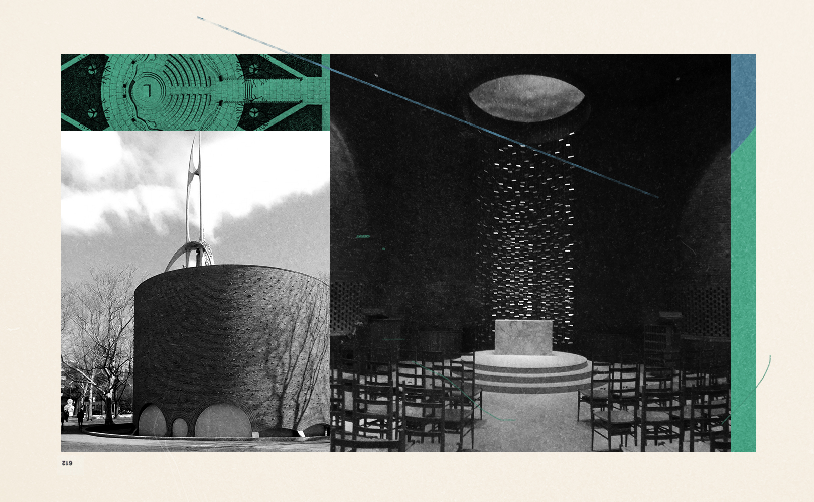
The small scale of chapels honors the individual’s need for reflection as a precursor to collective participation. The MIT Chapel designed by Eero Saarinen employs the totalizing geometry of the circle to create a hushed, prayerful environment set apart from its busy Boston context. The chapel’s simple brick walls are animated with the rippling reflection of outside water; such architecture ennobles the contemplative practices of silence and solitude as core dimensions of the Christian life.
 Illustration by Mallory Rentsch / Source Images Courtesy of Amanda Iglesias / WikiMedia Commons
Section
If the plan organizes space along the horizontal axis, the architectural section organizes space along the vertical axis. Orienting our attention upward, the section reveals a church’s theology of God’s relationship to us.
Note a church’s vertical height: The awesome, dizzying interiors of cathedrals evoke a theology of God’s transcendence and omnipotence. Conversely, small is also powerful. Small- or medium-sized interiors remind us of God’s immanence, or nearness, to our daily lives. The Chapel of St. Ignatius in Seattle is topped with light wells that wash the peripheral walls in subtle shades of color, reminding us to pay attention to the way God reveals himself through general revelation, such as in the changing beauty of a sunset.
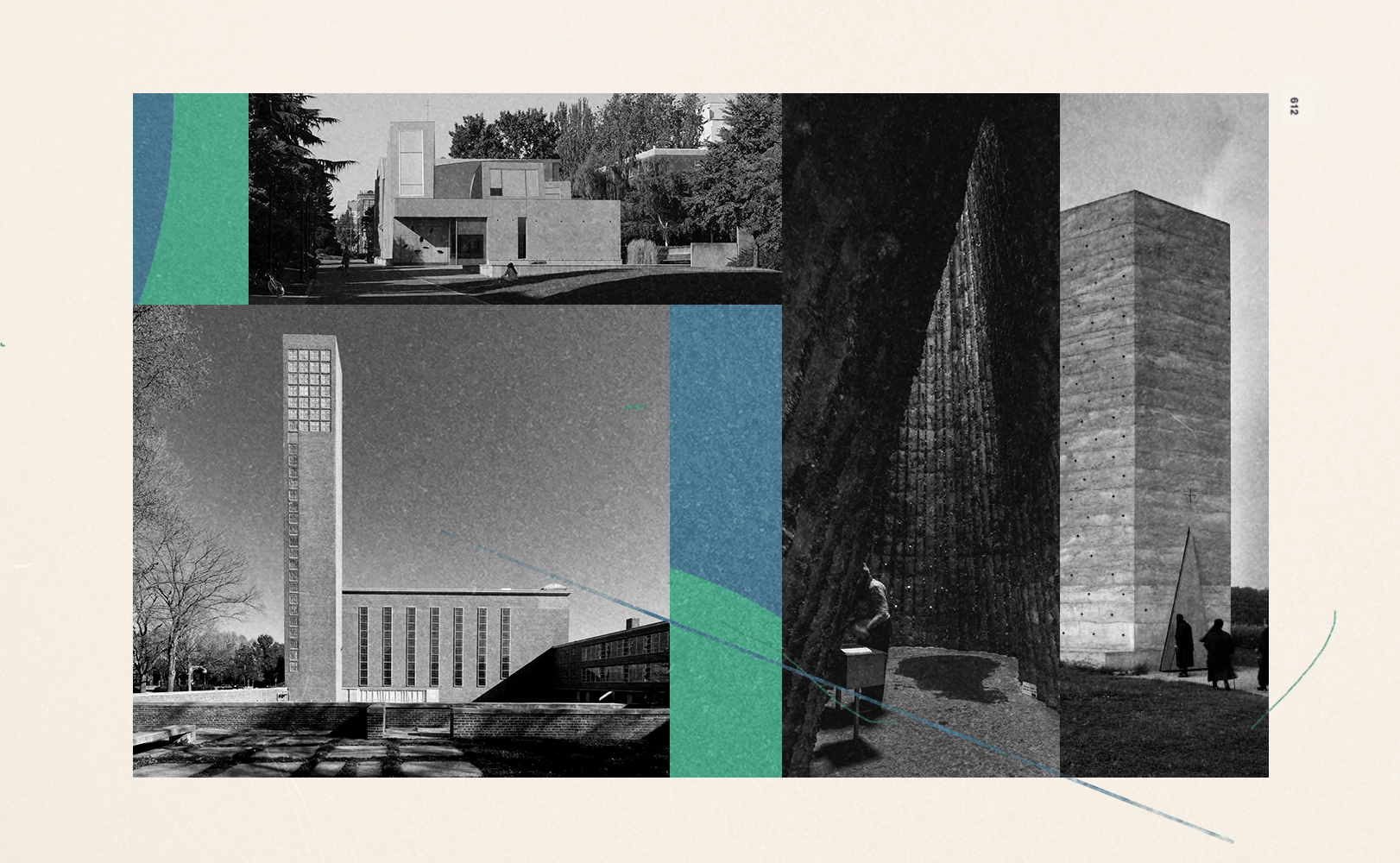
The section also determines how daylight enters a church. Note the presence and type of daylight: The quality of light from high Gothic clerestory windows, floor-to-ceiling panes of stained glass, or small storefront windows will differ. First Christian Church in Columbus, Indiana, designed by Eliel Saarinen, employs strong shafts of sidelight to illuminate the main auditorium, with concealed skylights to illuminate the altar’s back wall with daylight. This creates a “living” wall, the luminosity of which changes with every passing cloud.
Toplight also creates a powerful focus point. Peter Zumthor’s humble Bruder Klaus Field Chapel in northern Germany is a dark and charred concrete cavity illuminated solely by a small overhead oculus, reminding us that God’s light pierces the darkest places.
 Illustration by Mallory Rentsch / Source Images Courtesy of Amanda Iglesias / WikiMedia Commons
Contrast this with contemporary churches that have little to no daylight. The absence of daylight is increasingly commonplace, owing to the popular “black box” churches that rely on their own light systems for service. This is partly pragmatic. Many churches inherit, retrofit, or rent preexisting structures such as theaters, school auditoriums, or office buildings. Such environments can point us to architect Edward Sövik’s idea of a “non-church” church that is multifunctional and flexible and that emphasizes the idea that the church is first and foremost a gathering of people.
The point of this is not architectural knowledge. This can of course be a good thing to acquire, but nobody is being quizzed on how to identify a Corinthian versus a Doric column capital.
Reading churches is worthwhile, though, because churches are everywhere. They are constantly communicating theological truths through their architecture.
We often miss these daily reminders of truth. Yet we are invited to pay attention to the movements and workings of God in the world, through his people, and through our buildings. After all, what is spiritual formation if not developing eyes to see (Matt. 13:15–17)?
Amanda Iglesias is an architectural designer in New York City.


